Investopedia Stock Simulator Review
Investopedia is an ocean that can quench your thirst for financial knowledge.
The Investopedia simulator is the most famous of its genre which gives a platform for the beginners to learn and at the same time, it gives enough room for the experts to test out their new strategies.
But the simulator platform is really old and has not been updated for years. So, the latest features and most recent user interfaces are missing from this simulator.
Here we’ve made an effort to see how sharp the features of this most discussed simulator are.
Rating
3/5
Price
Free
Key Takeaways
The trading interface is fine, but at the same time the latest user interface features are missing. Stock Research module needs improvement and can be more comprehensive.
Portfolio management is lacking basic management capabilities. The simulator has not undergone any major feature changes since years thereby making it an out-dated one.
On the other hand, it’s a strong base on the educational front making it the paradise of financial knowledge hunters.
If you’re seriously looking to learn the strategies and technicalities of stock trading, You can definitely give a try to some other simulators which are more focusing on this front.
Want to learn basics of stock market?
Looking for easy to use mobile friendly virtual trading software?
Have a look to TradingKart Product - Free Stock Market Simulator with Great UI & Easy to Use Virtual Trading Interface
Investopedia Stock Market Simulator Review is calculated through below points -
- Registration Process
- Pricing
- User Interface
- Trading Options
- Stock Research Module
- Educational Material
- Portfolio Management Capability
- WatchList Functionality
- Ranking System
- Contest/ Game Feature
- Data Accuracy
- Other Features
Registration Process
Rating - 3/5
Key Takeaway - Lengthy and at the same time unnecessary steps are involved.
Description - Here the registration is a multi-step process. After filling details in the first window, it’ll take you to another one which will ask you to fill almost the same information again.
While in many simulators it’s a single step process, we found the registration process slightly long and boring.
First-Step

Second-step

Pricing
Rating - 4/5
Key Takeaway - Free and no hidden cost involved
Description - As the rightmost corner of the first window shows, it’s a free game. It didn’t ask for any payment- neither for registration nor for joining any game.
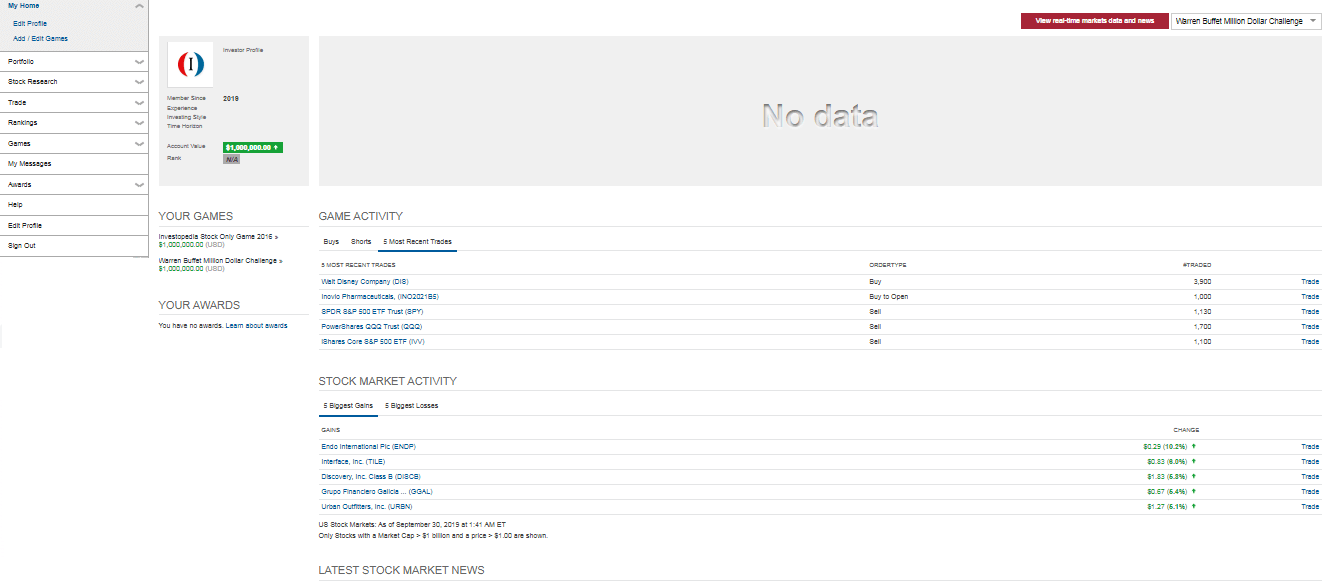
Depends upon your level of knowledge you can select the games. Initially, Investopedia will give you $1,000,000.00. The home page looks like this.
User Interface
Rating - 2.5/5
Key Takeaway - Old school and latest user interfaces are missing
Description - It’s easy to navigate through different options on this site. The windows of different options open soon on click –you don’t need to wait for “months or years” to open a window.
Even though an experienced person may find it very easy to use this simulator, we found something missing for a beginner and that is nothing else but a hover box. No-doubt, each window contains help topics.
But a hover box on the options of the menu might have made it easy for the beginner to understand the function of each option instead of going inside every window.
So, from a beginner’s perspective, we can say that it isn’t very user-friendly.
Want to learn basics of Investing? Have a look to - 12 Powerful Investing Basic Stock Simulators Can Teach You
Trading Options
Rating - 3/5
Key Takeaway - The latest features are missing, even though the existing features work smoothly.
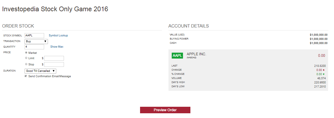
Description - This simulator will help you to practice trading on stocks and options by trying buy/sell, puts, calls as well as shorts.
Choices for buying on current market price or placing the stock orders are also easy here.
Although the existing features were easy to use and a user can sail smoothly through different options, the modern features that other simulators offer are missing here.
Trading Window for Stocks
Stock Research Module
Rating - 2/5
Key Takeaway - Antiquated and perplexing
This is the main screen of the Stock Research module.
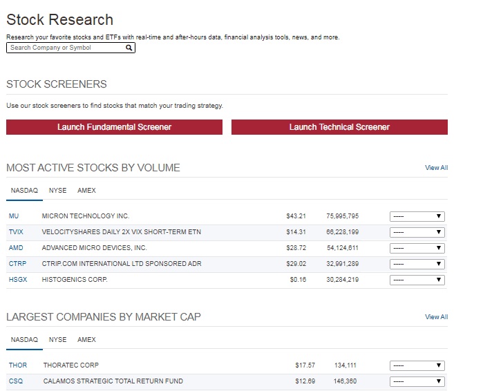
Description - By placing the company symbol, you’ll get company profile, technical chart and fundamental ratios in a new window.
The chart is very basic and in the fundamental part, to know what each ratio implies, you need to refer either Help or Education section each time.
Even it’s not given whether each ratio is mentioned as a multiple or as a percentage; leaving a beginner in confusion that a lower value or higher value is good.
In short, a lot of improvement can be done in Stock Research Module.
Education Material
Rating - 4/5
Key Takeaway - Powerful content and enormous topic collection make it exceptionally good.
Description - As we discussed in the starting of this blog, Investopedia is an ocean of financial knowledge even some people call it a university.
Under the Education section, there are two options – General and Investing/Trading. In the General option, there is a financial dictionary.
It’ll make you aware of what is happening in the corporate world and defines of terms associated with economy, corporate finance as well as personal finance.
Information given in Investing/Trading is enough to make you mindful of various terminologies and strategies of the stock market.
Portfolio Analytics
Rating - 2.5/5
Key takeaway - Trade history updates instantly however, a beginner may find it less user-friendly.
Description - Your trades get updated in no-time and it shows the commission as well as the total transaction cost.
It even gives the data of the most popular buys and shorts. While the performance history updates only after the market closure.
A beginner may find it perplexing due to lack of guidance.

Watchlist Functionality
Rating - NA
No watchlist functionality is included in this simulator which is again a drawback.
Leader Board
Rating - 2.5/5
Key takeaway - Less user-friendly and latest tools are missing
Description - Under Rankings,you will get the list of the leaders of your active game. But, if you’re playing more than one game parallel, there is no option to switch to the other games.
Every time you need to go to Games to change your active game.
There is no comparison of your performance with the top players of the active game.
Contest / Game Features
Rating - 3.5/5
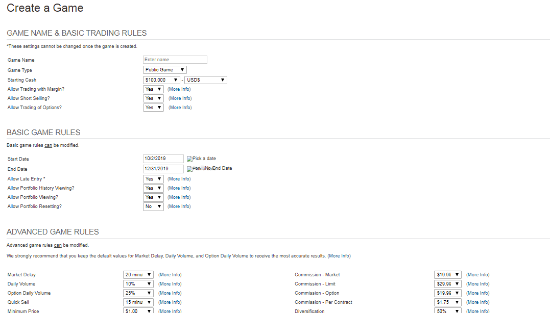
Key takeaway - A Lot of options are available. Even facilitates to create a private game.
Description - It’s a pool of games. You can select the games depends upon your knowledge level.
If no game can fascinate you, then it gives you the luxury to create a private game.
Data Accuracy
Rating - 2.5/5
Like any other simulator, data updates every fifteen minutes.
Other Features
Ranking - 2.5/5
Key takeaway - Awards are motivational boosters. But, more rewarding features are required to attract players.
Description - Here you’ve got the facility to order outside the market hours. This will help the beginners, who are not familiar with the starting of the market hours, to place order to buy/sell.
Awards are the motivational boosters. They are nothing but certain points that you get for performing certain types of trades or reaching a specific rank. “Street Cred” points are assigned to each award.
This is all about the review of "Investopedia Stock Market Game". You might be interest in -
Best Stock Market Simulators for United States Market